
Slow sites feel broken and suspicious, so in the world of web development, all anyone’s talking about is site speed.
It’s not so much the fact that web developers and site owners are passionate about performance, but because speed is often the difference between a professional-looking website and one that looks like it’s been cobbled together as part of a middle-school project.
Users don’t measure milliseconds, but if the page hesitates, they tend to hesitate as well. Google’s research suggests that on mobile, once load time creeps past three seconds, as many as 53% of visitors give up and leave.
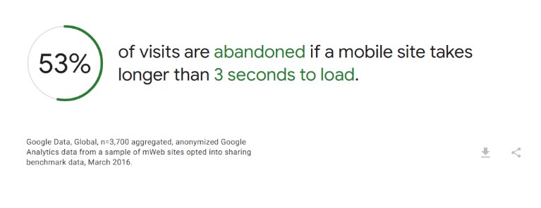
That’s basically half your audience turning around and walking out if your site loads like treacle. So yes, this is about web development metrics, but it’s more about trust and not giving your visitors a reason to tap the back button.
Core Web Vitals: What Are They All About?
These are basically Google’s way of determining if a page loads quickly and feels stable when a real person uses it. The numbers may look like abstract lab scores at first glance, but they actually reflect what humans experience out in the wild.
The current targets Google points site owners toward are pretty straightforward: keep your LCP within 2.5 seconds, INP under 200 milliseconds, and CLS under 0.1. If those acronyms mean nothing to you right now, don’t worry; we’ll get there.
For now, just know that each metric presents a different kind of problem. One is about waiting, one is about laggy reactions, and one is about how much the page moves around as everything loads up.
Stop Guessing And Start Measuring
Deleting a plugin and declaring that a site feels faster is not a strategy. It’s like sacrificing a goat, hoping for the rain to come.
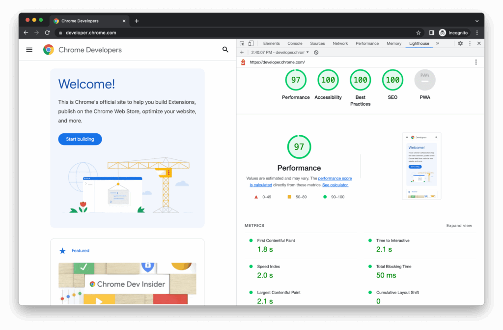
The scientific method relies on a mix of lab and field data. Lab tools (like Lighthouse) are good for spotting obvious problems and testing changes quickly.
Field data, on the other hand, tells you how real users are doing over time on real devices, with real networks. Heads up, though: Chrome UX Report data is aggregated over a 28-day window, so improvements don’t always show up instantly everywhere you look.
So, don’t do one tweak, refresh a score, and consider it settled. Track trends and look for consistent movement.
Fast Wins Come From Fixing Dumb Mistakes
LCP (Largest Contentful Paint) is often dominated by one of three things: a large image, a big block of text rendered late, or a web font situation that delays the first meaningful look of the page. The goal is to make that main content appear quickly and reliably.
That means you should serve images in modern formats where possible, and make sure the browser isn’t downloading a 3000-pixel-wide banner to display it at 900 pixels. Also, cache aggressively and don’t load decorative nonsense before the page displays what actually matters.
Javascript Comes With A Performance Tax
The modern web has a habit of shipping far too much JavaScript, then acting surprised when the browser struggles. Every extra script means more downloading, more parsing, more executing, more potential long tasks, and more chances to ruin interactivity.
INP (Interaction to Next Paint) is where this comes back to bite you. In the simplest terms, this metric is poor on those sites that feel like they need a moment to think things through every time you click a button.
The fixes are usually boring (you’ll notice that’s a trend here). You should cut what you don’t need, split what you do, and load things later if they aren’t essential. That means delaying third-party scripts until the page is stable, and removing widgets that run half a circus behind the scenes.
Stop The Page From Messing With Your Visitors
A page with a high Cumulative Layout Shift (CLS) feels like it’s mocking you. A visitor goes to press the CTA on your contact page, when suddenly, an image loads and the button moves to a different position entirely, as if trying to evade them.
The fix here is usually about reserving space and being disciplined. If something is going to appear, give it a stable box from the start, and specify image dimensions so the browser can lay out the page without guessing.
Be careful with late-loading banners, and don’t inject content above what the user is already looking at unless you want them to misclick and hate you forever.
Smart Tools Can Help, But They Have Their Limitations
There’s a time and place for automation, and it’s when you’re trying to spot patterns across an ever-growing codebase. AI technology can help highlight unused assets, flag repeated bottlenecks, and suggest optimizations.
But it’s not magic. It won’t save a site that insists on loading seven font weights, a video background, and three analytics suites before showing any content. Treat it like a diagnostic assistant, not a replacement for judgment.
You Don’t Need Perfection
If you think the whole world is doing great and there’s some impossible standard of quality you have to reach, think again. Chrome UX Report release notes have shown that only 46.8% of origins had ‘good’ Core Web Vitals in a reported snapshot.
That means the median web experience is still middling at best, and to stand out, all you need is competence and consistency.
Keep an eye on your performance, because conditions change. Marketing adds scripts, design adds media, devs add features, dependencies update, and browsers evolve. So build a habit of monitoring and verifying. Make it hard for regressions to sneak in.
The Point Of All This
Improving loading speed and Core Web Vitals isn’t about pleasing a scoring tool. It’s about building a site that feels stable and responsive, so users don’t have to think about whether they trust it or the company behind it. They stay.
And when that happens, all the other good stuff, like SEO, conversion, and engagement, gets easier.