If you own a SaaS (Software as a Service) business, you will understand that having just any landing page is not enough. You want something that will get your visitors hooked and persuade them to buy your product or subscribe to your services. This is the least you can do if you want your enterprise to stand out in the highly competitive SaaS industry.
However, the problem lies in finding the right design that is captivating enough to convert your visitors. Hence, in this blog post, we will explore what defines a SaaS landing page, identify its top features, review the 10 best examples, and explain how you can craft the perfect one for your business.
What Is a SaaS Landing Page?
A SaaS landing page is a standalone web page that contains persuasive content created with one main objective – conversion. An example is a page on a website like Salesforce that encourages users to use its AI (Artificial intelligence) services. Why do SaaS companies need landing pages?
Consider this scenario. A buyer clicks on your website and begins exploring the content to gather more information about your product or services. Eventually, the visitor clicks on several links, becomes distracted, and eventually leaves without taking any action.
Unlike a website, it doesn’t contain elements like navigational links that will lead users away; instead, it guides visitors to one desired action – signing up for free trials, subscribing to a service, or paying for a product.
Features of a Good SaaS Landing Page
A killer SaaS landing page will contain the following features to successfully convert visitors.
- Product headline: Your headline is the first thing visitors will see when they click on the page. It should be attention-grabbing, straight to the point, and describe your product or services as best as possible. One example is “Revolutionize your workflow with cutting-edge AI.”
- Screenshots or videos: Video demos and screenshots are visual guides that give visitors a glimpse of your offerings. They should be high-quality and descriptive enough to convey the intended message to your audience.
- Unique Value Proposition (UVP): This is a statement that communicates the value and benefits of your offerings to your audience. The UVP should be clear and must be unique to your services.
- Call-to-action (CTA): These are buttons that encourage visitors to take specific actions before leaving your website. The best practices for CTAs are that they should be visible enough for your visitors to see them and should contain the text describing actions your audience should take.
- User testimonials: These are powerful ways to build trust with prospects and turn them into buyers. You should ensure that the testimonials are from users who have actually used your products to boost the credibility of your business.
- Social proof: It shows your audience that others have already used your products and benefited from them. Social proof can be the number of customers, companies or positive reviews a SaaS business has.
- Contact information: This important element makes it easier for your visitors to get in touch with you. Including contact information shows visitors that you are available and willing to attend to any questions they have.
Ultimately, incorporating all these elements will guide your visitors seamlessly toward conversion, guaranteeing a positive user experience from when they click on the page till when they take action.
10 Finest SaaS Landing Pages
Now, let’s go through the top 10 SaaS landing pages.
Figma
Figma’s landing page starts with a clear headline that undoubtedly communicates the value proposition of the product. It has two CTA (Call to Action) buttons that clearly explain to any visitor who clicks the link the action that is to be taken.
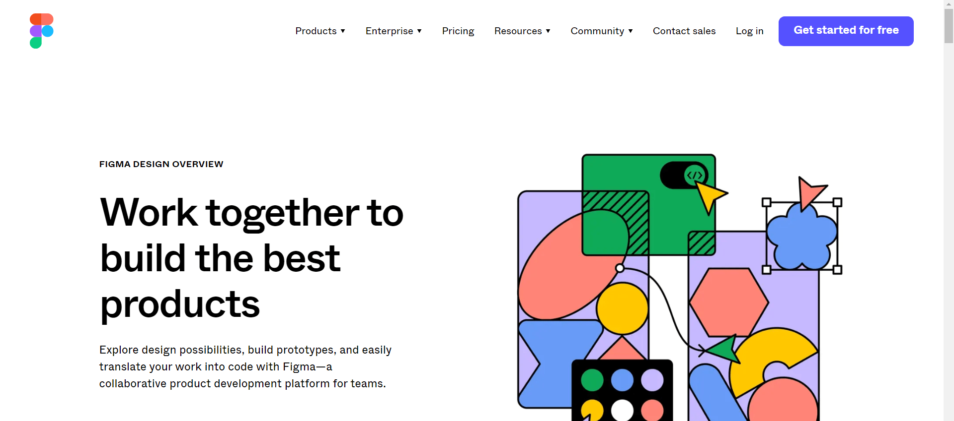
In addition, the part below the hero section is a social proof that tells visitors the number of companies that trust the products. Overall, it uses concise and persuasive copy throughout to show prospects the benefits of the products.
Taskade
Like Figma’s, Taskade features a bold and concise headline that immediately makes the purpose of the page clear. In addition, animated product demos showing how to use the product are strategically added with clear and concise content that seeks to address visitors’ pain points.
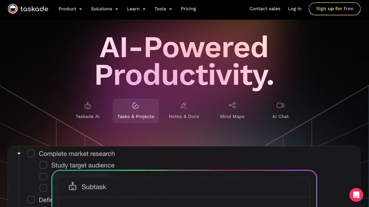
While the page has only one CTA button, there is a large CTA on the main menu that encourages visitors to sign up for free.
Mailchimp
This popular email marketing platform enables users to write, send, and analyze email and ad campaigns. Mailchimp landing page is built for success as it features an eye-catching hero section with a powerful headline, description, and CTA button, along with excellent use of whitespace, often mixed with matching color palettes.
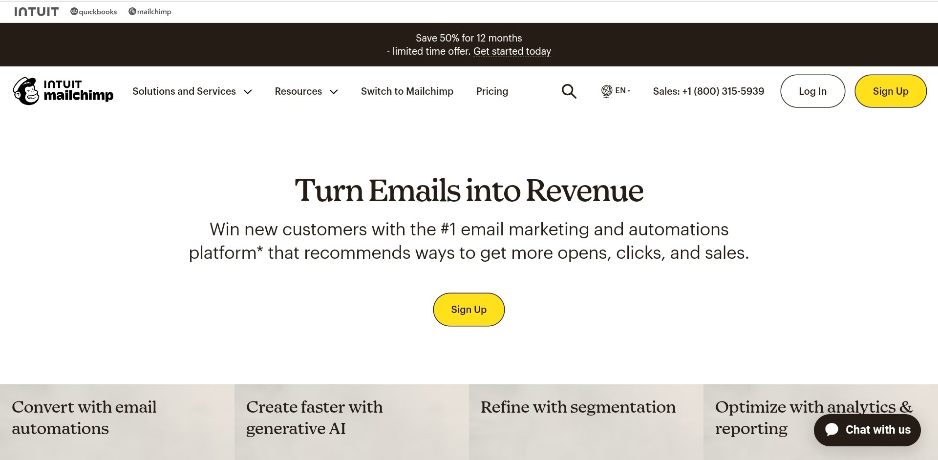
There is also a pricing section that presents premium, standard, essential, and free packages. It also contains images that show how the product can be used along with other marketing software.
Monday.com
Monday.com includes instructional videos of the benefits of the products and an FAQ (frequently asked questions) section that clearly answers questions visitors might have. Overall, the page has two CTAs and prominently displays awards to show the credibility of the product.
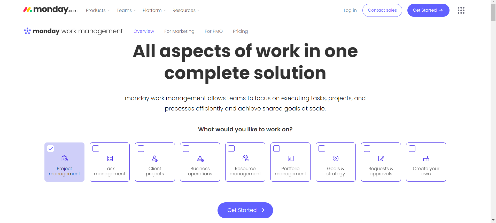
This landing page was created to clearly show the various project management products the company offers, with a simplified design that eliminates distractions and makes visitors focus on its core services.
Zapier
Zapier is a SaaS that allows users to automate workflow and accomplish more with less work. Its landing page contains several elements, from CTAs thoughtfully placed on the hero section to images that break the content flow and social proof that builds trust.
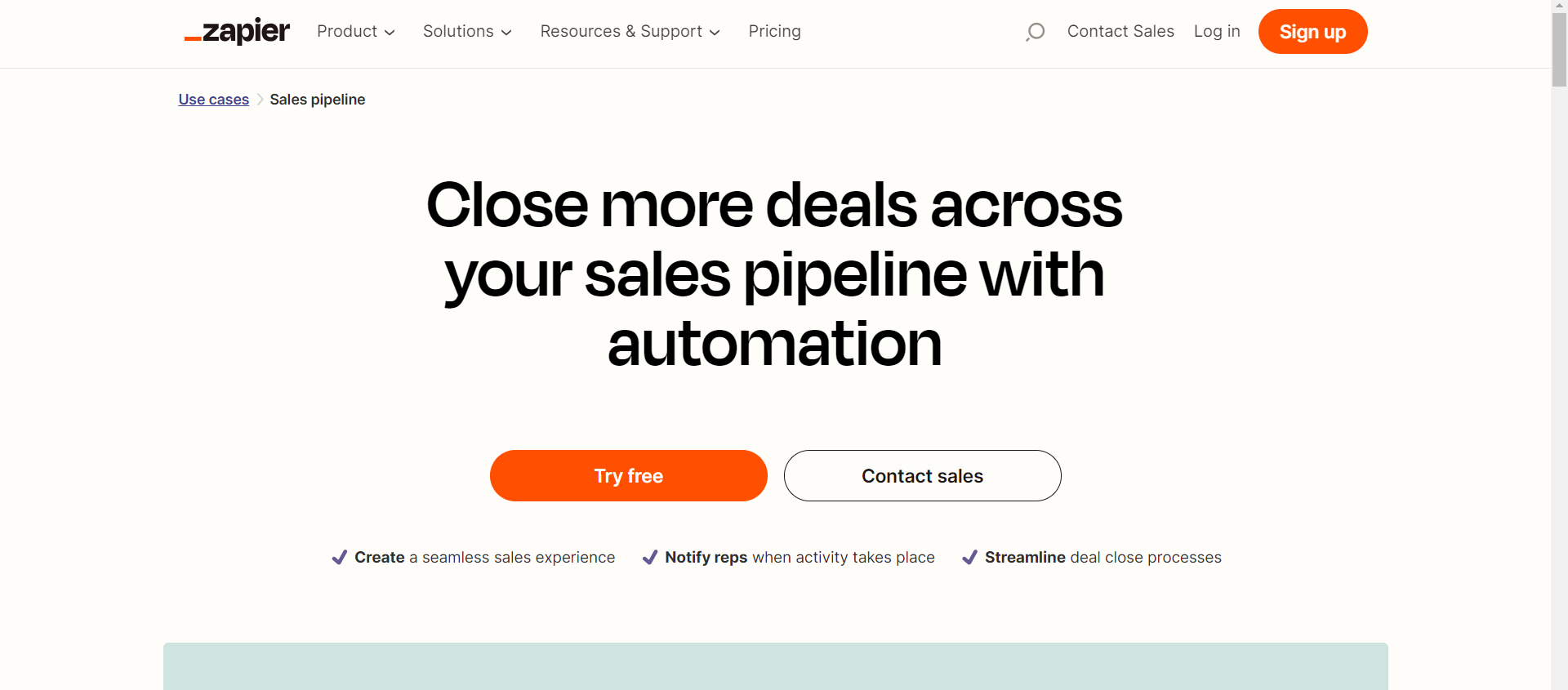
To ensure visitors take action, it features customer success stories that show how other businesses have successfully used the product. There is an excellent use of white space, which makes the content easy to follow.
Leadpages
If you want a SaaS landing page that sells your product or services without confusing your visitors, this one is for you. Like other businesses, it has a hero section with a headline, description, CTA and a video demo. However, it stands out because of its well-crafted content that assures visitors that they can create their dream page within 30 munites.
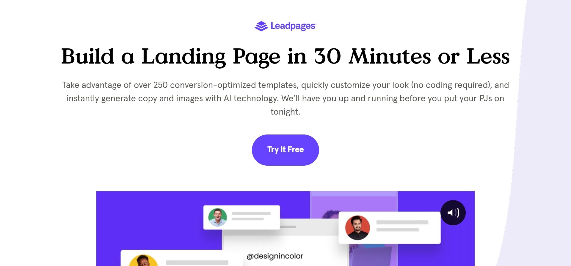
At the bottom is another CTA that encourages visitors to try the product for free for 14 days.
Wix
The aesthetic of this Wix landing page is quite outstanding. It includes a solid-colored background that contrasts with the bold white headline, making the content clear enough to read. The subheadline when further describes the benefits of using Wix to build a website. On the page are two CTAs that encourage visitors to start now and a simple image that shows what creating a site with Wix looks like.
Asana
The use of colorful images and bold typography makes the Asana page engaging and visually appealing. The hero section features a well-crafted headline, a powerful description and a well-thought-out CTA that encourages visitors to get started.
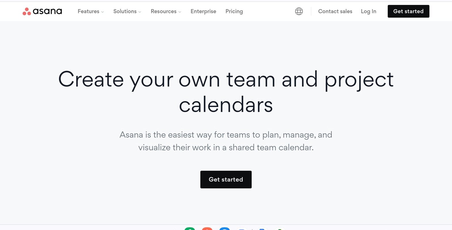
Also, there is a section that explains the benefits of using its services. It also features companies it has partnered with and customer reviews to build trust and credibility with its visitors.
Semrush
This Semrush landing page is specifically designed to highlight the features of the products for anyone who clicks on it. It has a simple headline, a short description, and a large CTA button perfectly placed beside an illustrative image.
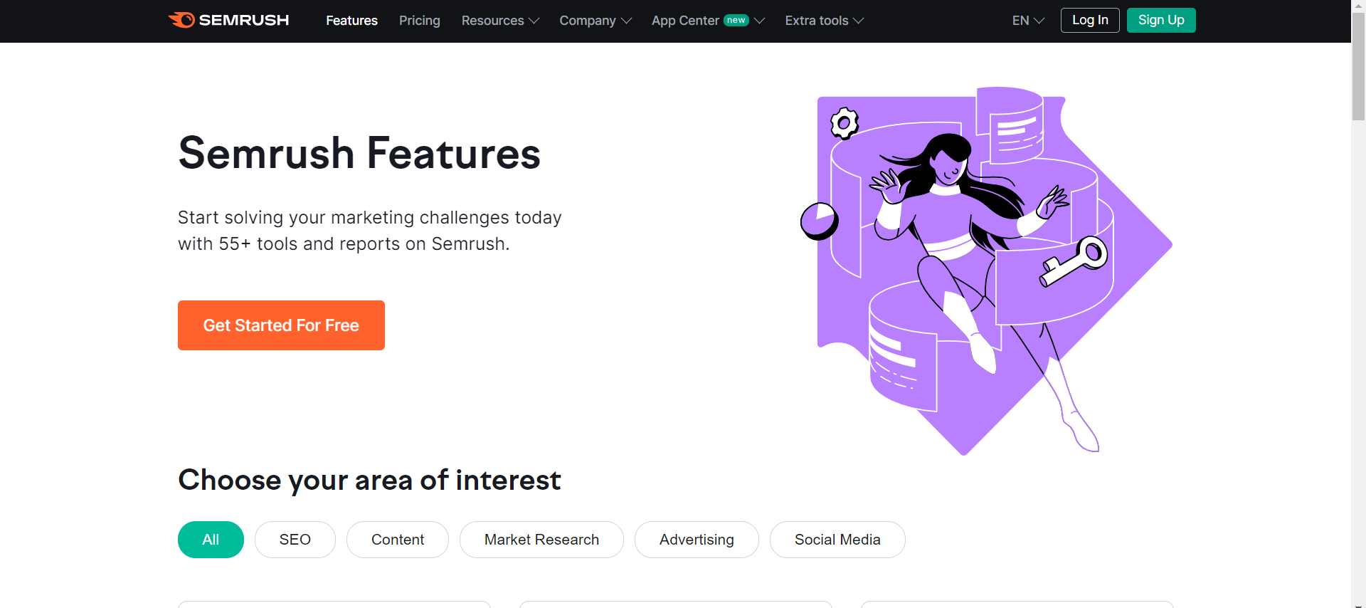
Below the hero section is a part that lists all the tools available for use. At the bottom is a section that includes a subheadline and a CTA encouraging visitors to try the product.
ExpressVPN
ExpressVPN’s landing page design reflects a thorough understanding of its audience, which is evident in the well-crafted headline and CTA button. The page also features a 30-day guarantee to build trust with its visitors. It also has a short instructional video to educate users who want to know more about their services.
This is in addition to a section that explains how visitors can sign up and get the VPN services.
How to Develop the Perfect SaaS Landing Page
Building a powerful landing page that converts visitors is the dream of every SaaS business.
Below are some tips on how to create one:
Specify Your Goal
To make a landing page efficiently, you have to know what goal it will serve. While it can serve many purposes, companies often use them to:
- generate leads or signups;
- promote a product or service;
- encourage prospects to sign up for free trials.
Once you know what goal you want to achieve, finding the right design and crafting the best content will be much easier.
Know Your Target Audience
Before diving into design and content, ask yourself, “Who am I making this page for?”. For SaaS companies, the target audience can be diverse and range from individuals to other businesses. Identifying your audience —their needs and pain points—will allow you to deliver value-added copy, which will help increase conversions.
Start by analyzing your existing user base to know who is currently using your services. Aside from that, conducting market research to identify potential customers is also beneficial. Data analytics tools can also help gather insights about audience behavior and preferences.
Choose a Perfect Design
Once you know who you are making it for, what features to add, and the CTAs, it is time to start designing. A good landing page should include:
- headline, subheadlines, and CTAs;
- a section for product features;
- social proof, like testimonials;
- video demos and images.
In addition, it must be visually appealing and user-friendly and should clearly communicate your value proposition to inspire visitors to take the desired action.
Add Content
The content on your SaaS landing page helps visitors to better understand your business. To keep them engaged, you should create an eye-catching and concise headline that clearly explains the purpose of the page. Aside from that, add clear and concise content that highlights the features and benefits of your offerings. It is recommended to keep the content simple and jargon-free to ensure clarity so that visitors will understand the value proposition quickly and take action.
Optimize for Conversion
Optimizing your SaaS landing page for conversion is crucial because it enables you to get free organic traffic that would have been costly to get with paid ads. To do that, you have to add keywords to the meta title, meta description, and content and use the right anchor text for your CTAs.
In addition, you should ensure the page loads quickly and is responsive on all devices, especially mobile. You can utilize the A/B testing methods to experiment with various designs and improve them based on performance data to boost conversion rates. This is particularly essential for B2B SaaS platforms, where the sales cycle and decision-making process differ significantly from B2C environments.
More specifically, B2B transactions often involve longer decision times and multiple stakeholders, making it essential to tailor your landing page’s content and structure to meet the specific needs of business clients. Therefore, hiring a B2B SaaS SEO agency is a great way to gain expert insight on the best ways to enhance visibility and drive leads.
Conclusion
For SaaS companies that need to stand out in a competitive market, a unique landing page is a recipe for generating leads and increasing conversions. However, it must contain features like a strong headline, clear CTAs, persuasive content, and social proof to produce the right results. To design one, you have to know your target audience, set a goal, add keyword-rich text, and continuously enhance it for SEO to drive conversion. Doing all these will ensure that your SaaS business stands out from the crowd and converts visitors seamlessly.

